The Psychology of Colour: How to Choose the Right Frame Colour
Colour is not decoration. In the context of luxury glasses, it is a material decision — one that determines how a frame interacts with skin, light and the face of the person wearing it. Understanding how colour works is part of what distinguishes a considered choice from an impulsive one.
Colour as depth, not surface
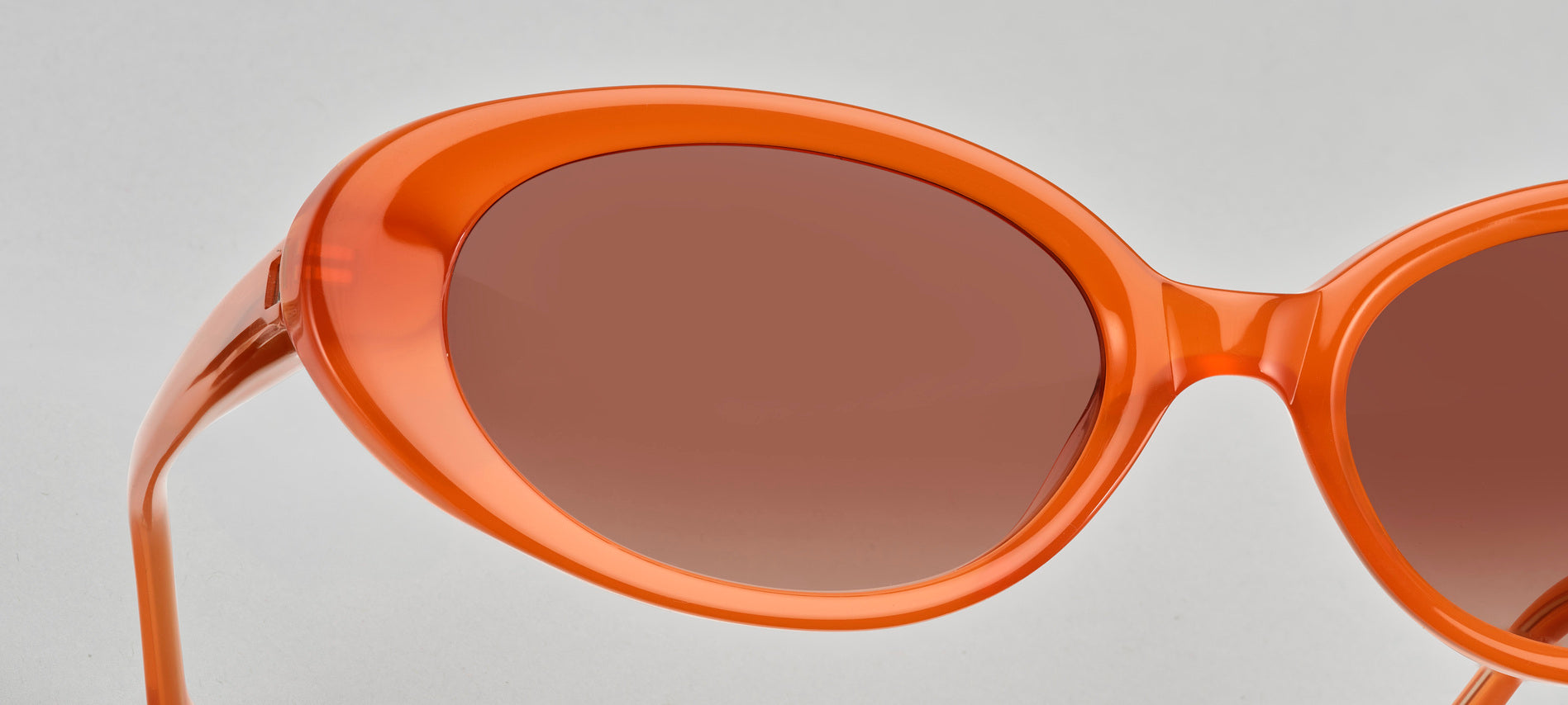
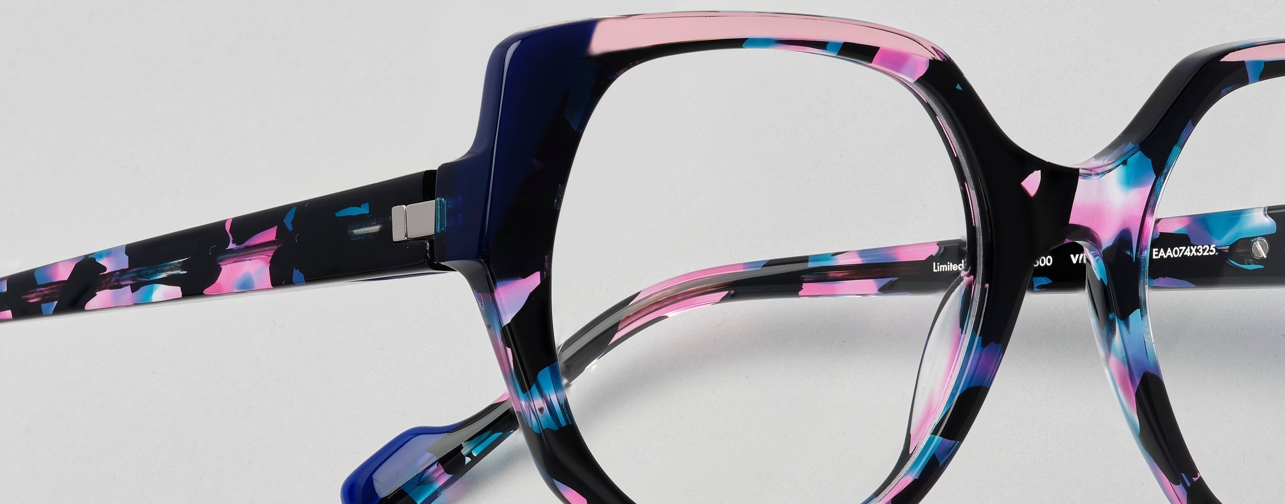
In premium optical frames made from high-density acetate, colour is not applied to the surface. It runs through the material itself. This means that the colour you see in a display case is not the full story — hold the frame up to light, and you will see layers, transparency, variation. The colour shifts with the angle and the source of light.
This is a fundamental difference between designer glasses made from quality acetate and those produced from cheaper injection-moulded plastic. The depth of colour in the former is part of the material, not a coating that can chip or fade.
Warm and cool tones
The first question in choosing a frame colour is whether your skin tone is warm or cool. Warm skin tones — with golden, peachy or olive undertones — generally work well with tortoiseshell, amber, warm browns, olive greens and rich reds. Cool skin tones — with pink, blue or neutral undertones — tend to suit black, grey, silver, blue and clear acetate.
This is a starting point, not a rule. The best French eyewear designers approach colour the way a painter approaches a palette: the goal is contrast, balance and harmony — not compliance with a formula.
The acetate palette
At TARIAN, almost half of the acetates used in each collection are developed exclusively for the brand. This means the colours available are not drawn from a standard catalogue — they are specific tones chosen for their relationship to light, to skin, and to the particular forms of each frame.
Translucent acetates catch the light differently throughout the day. A frame that appears pale amber indoors deepens in sunlight. A clear acetate with a subtle grey tint reads almost invisibly in some lights, then reveals its colour in others. This behaviour is part of what makes handmade glasses in acetate worth the investment — the object is not static.
Colour and form
The colour of a frame interacts with its shape. A strong geometric form in a dark, saturated colour can feel heavy. The same form in a translucent tortoiseshell reads as lighter — present, but not imposing. For independent eyewear, this relationship between form and colour is part of the design — not an afterthought.
A pale or translucent frame tends to recede, letting the face come forward. A saturated, opaque frame asserts itself. Neither approach is wrong — but understanding the effect helps you choose deliberately rather than accidentally.
Paris eyewear and the long view
The most useful question when choosing a frame colour is not what is fashionable, but what will still feel right in five years. Luxury sunglasses and optical frames are not seasonal objects. They are worn daily, and they age alongside the person wearing them.
At TARIAN, the acetate is chosen to improve with wear — to develop a surface patina that deepens over time. The colour you choose now is the colour you will live with. Choose it with the same seriousness you would bring to any object that matters.